Role
UX & Visual Lead
Scope
UX structure, value communication, interface design
Collaboration
Sales, Analysts, Product
Duration
4 — 6 weeks
Project overview
I led the UX and interface design of a web-based ROI calculator for Keepit, a cloud data backup and security solution provider.
The calculator replaced a complex Excel-based financial model and transformed it into a streamlined, interactive sales enablement tool. It enabled sales teams to generate tailored, presentation-ready ROI reports during prospect demo sessions.
Challenge
Excel-based ROI model was complex and difficult to use during live demos.
Solution
Designed a web-based calculator with guided inputs and real-time, shareable ROI reports.
impact
Improved demo efficiency and strengthened value communication in enterprise sales.
design rationale
Business Validation Flow
The interface was structured to transform complex financial modeling into a guided, low-friction decision experience. Clear separation between input, output, and benefit visualization reduces cognitive effort while reinforcing transparency. Progressive disclosure of value supports executive evaluation and strengthens trust in the financial logic behind the tool.
Hover over the markers to explore the structural logic.
1
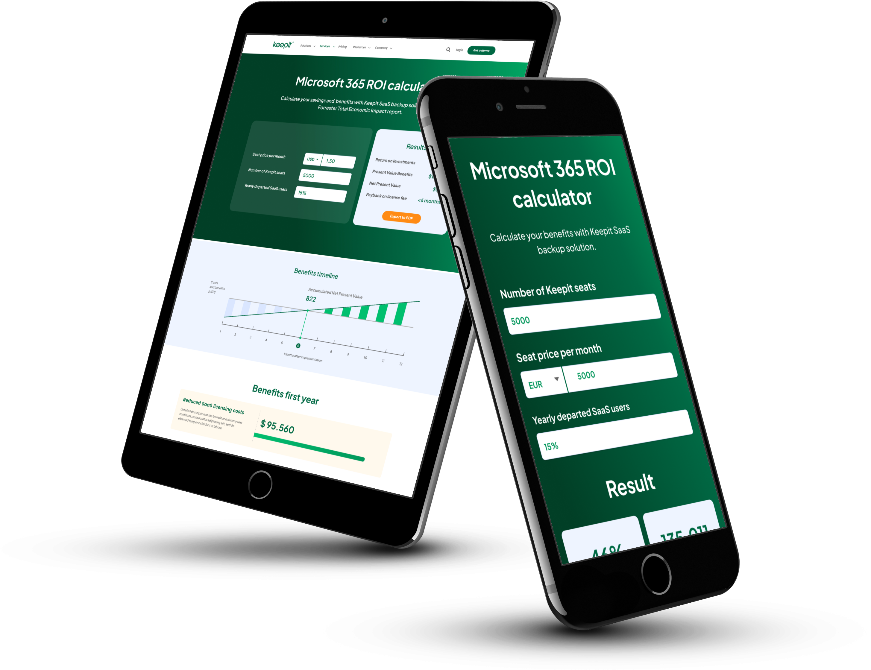
Dual-Panel Decision Architecture
Separated input fields and outcome summary into two distinct panels to create a clear cause–effect relationship between user data and financial results.
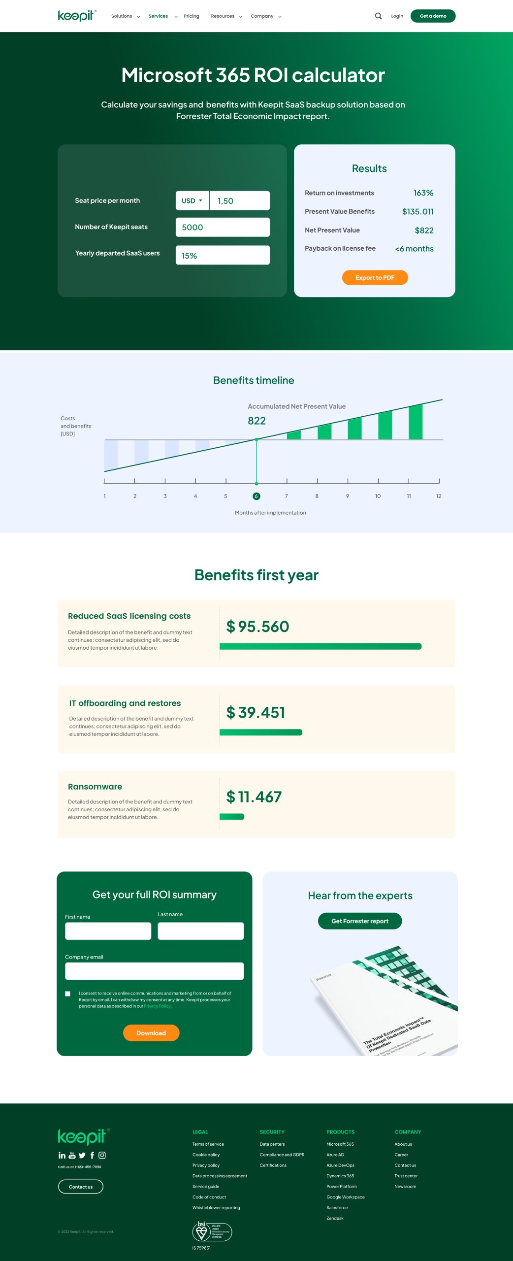
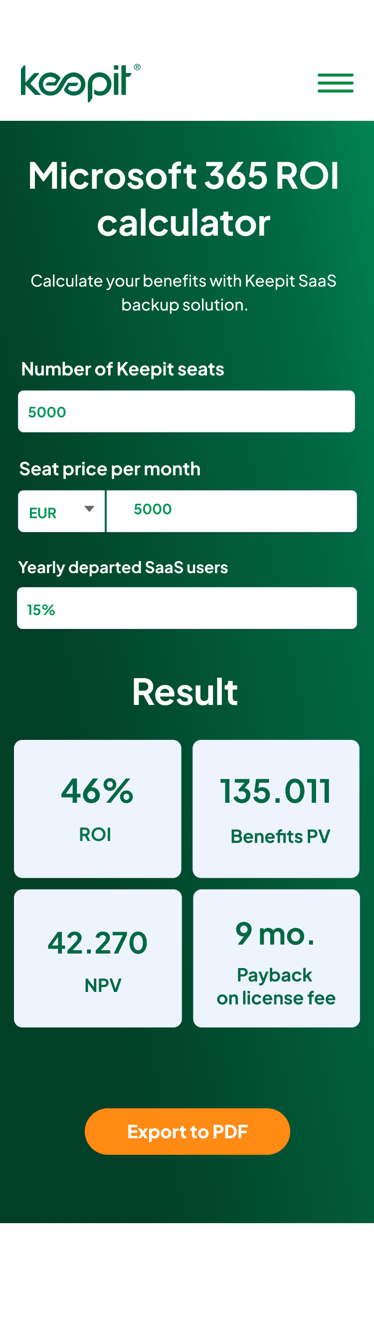
2
Immediate Value Framing Above the Fold
Displayed ROI, NPV, and payback period directly in the initial viewport to surface business impact before requiring deeper exploration.
3
Visualized Payback Timeline
Translated financial return into a time-based visual graph to make abstract ROI metrics tangible and easier to understand.
4
Benefit Decomposition Layer
Broke down total ROI into categorized benefit blocks with quantified outputs to increase credibility and analytical transparency.
5
Conversion-Embedded Reporting Flow
Integrated the lead capture form at the point of high-value insight, positioning report download as a logical next step rather than an interruption.